

Grownout – REFERRAL HIRING PLATFORM
CHALLENGE
Business stakeholder knows that UX in their referral hiring system can minimise the efforts to hire a candidate. To enhance the overall user experience, wanted to make interface intuitive for the users.
STAKEHOLDERS GOALS AND OBJECTIVES
Stakeholders want to minimise the steps that were usually took place to hire a candidate and want to design a system which is very ease to use and change the traditional hiring approach.
STAKEHOLDERS INTERVIEW & UNDERSTANDING EXISTING FLOW REFERRAL HIRING SYSTEM
Based on the basic business understanding we have to start our discussion. Find out how HR works, what’s the basic process that usually follows by different HR for hiring .
The objective of the study was need to understand the steps that can be used avoided without affecting the process result through heurstic approach.
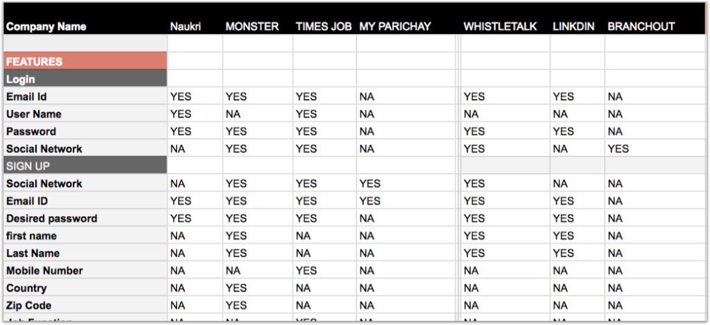
COMPETITIVE ANALYSIS
After getting basic business understanding, we want to know the landscape of hiring companies. Competitive analysis helped us to know how other competitors are working in the process.
SURVEY
Although co-founders know most of the things about their business, but there was something that must be touched by a designer, so we decided to start our research work with questionaires.
Questionnaire was prepared for different set of user roles to derived the basic problems users were facing.
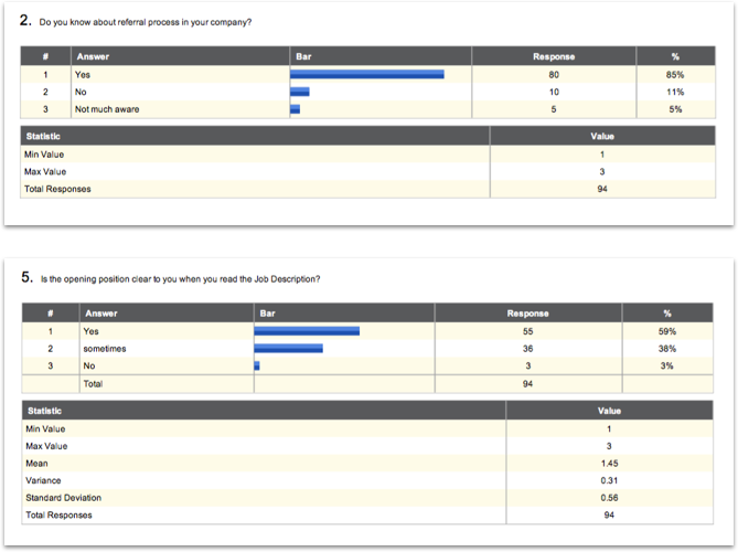
Survey- what is delightful, confusing, or frustrating about their current experiences?
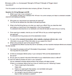
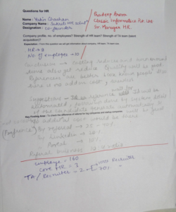
CONDUCTING INTERVIEWS OF DIFFERENT ROLES
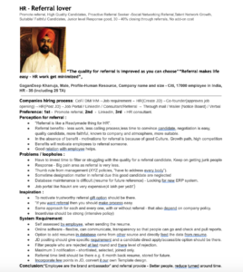
Contextual Inquiry always help us to dig into the pain points of users. So for each user group (HR, Hiring Manager, HRM, Employees (Referral, Refree)) 8 – 10 interviews had been conducted based on open ended questions. Users were asked to think aloud, what they feel?
PERSONA
After conducted all interviews of all stakeholders, insights like what were the essential things required, the communication gap and absence of transparency synthesised into personas. Each persona have different painpoints and feature requirements.
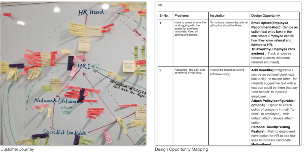
CUSTOMER JOURNEY & DESIGN OPPORTUNITY MAPPING
The user’s painpoints, features requirements and gaps could be our design opportunities, solution to these requirements could fasten the overall hiring process.
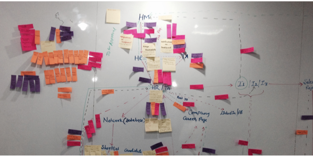
EXPERIENCE JOURNEY
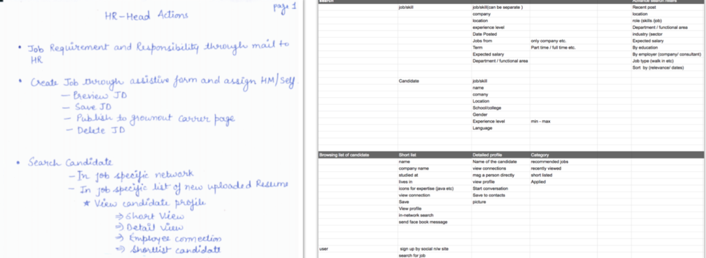
With the decided features, a new task flow had been created to match persona’s mental model. This exercise helped us to decide, how the new system should work. At this step features were further breakdown into the elements (like the form fields, actions, notifications etc.) and interactions between the stakeholders so that we could map it to the wireframes.
FEATURE LISTING
To increase adaptability, features should be categorized into meaningful groups, using card sorting technique. Business stakeholder needed to decide all possible features that could be included in the new system.
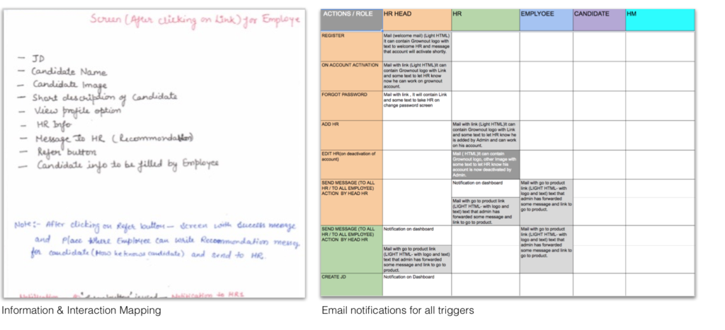
INFORMATION DESIGN
Information Architecture has involved us in arranging this information in a way that is easy to understand, and can be scaled. The way we piece that information together determines how well people will be able to navigate and consume it.
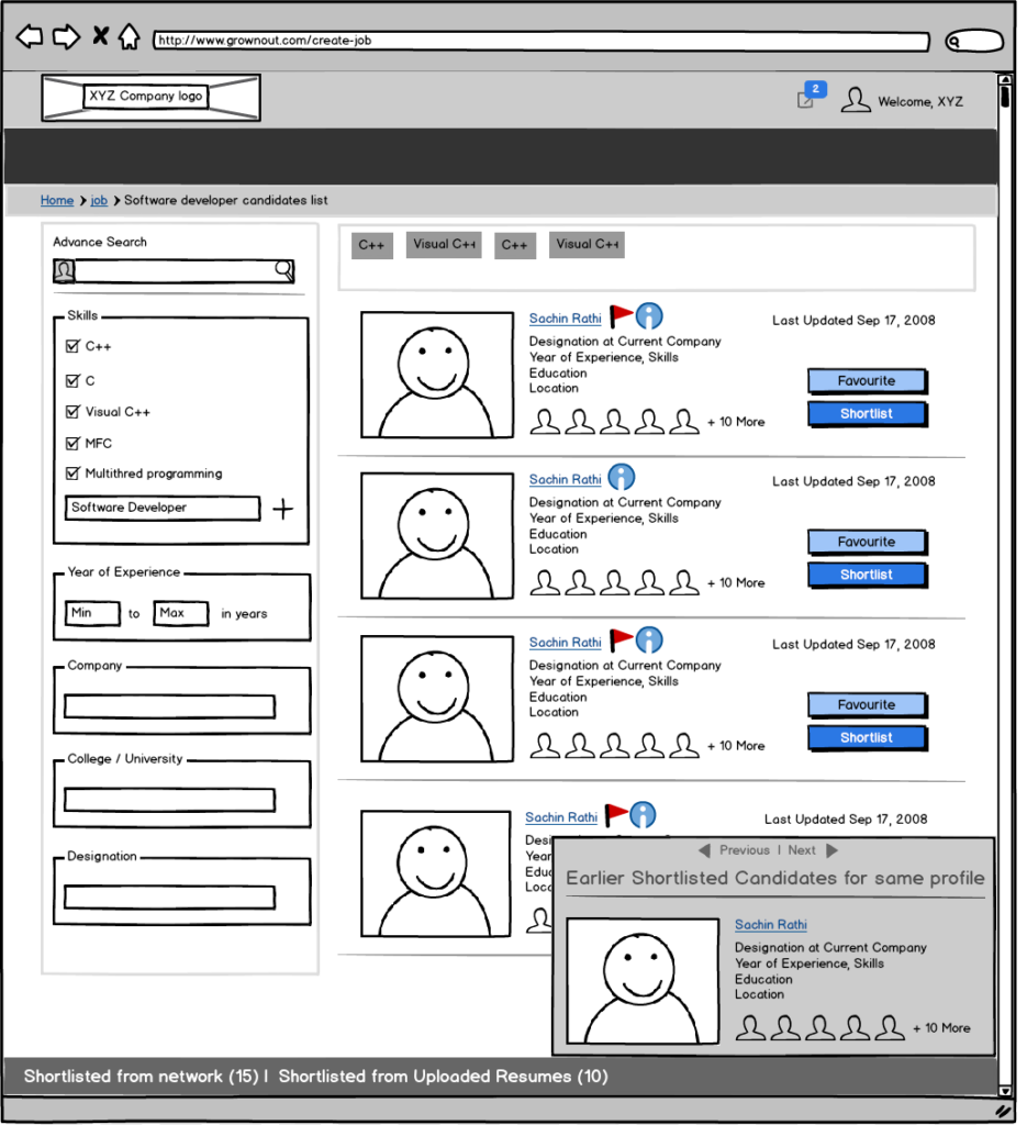
MID FIDELITY PROTOTYPING
After finalising the flow, features and information design, its time to design interface with paper prototype(low fidelity) to validate with few users and the business stackholders. Paper prototype was further converted into mid fidelity clickable prototype for usability testing.
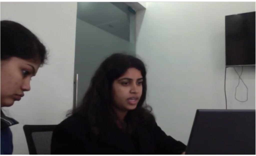
USABILITY TESTING
Time to test mid-fidelity clickable prototype, users asked to perform few tasks on open-ended questions and task analysis with think aloud protocol for their feedbacks. User’s final feedback discussed with the stakeholders to produced the final iterative screen.
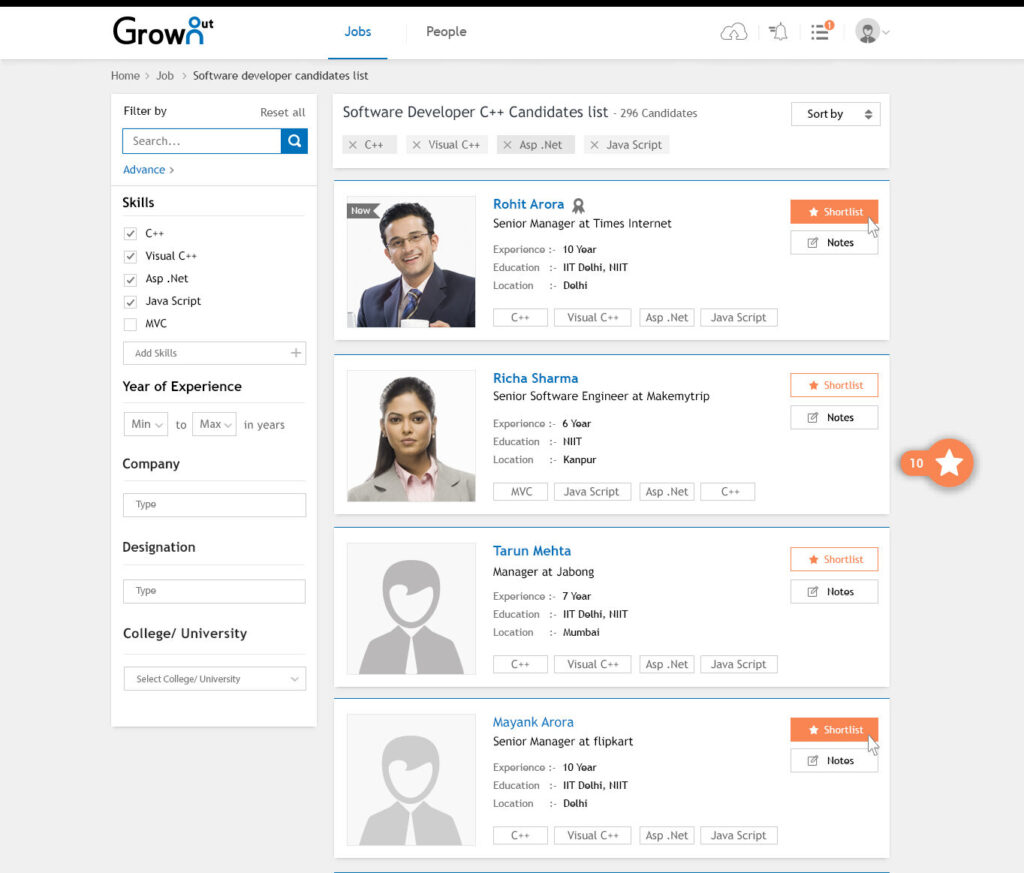
VISUAL DESIGN
With the understanding that there is no one “perfectly beautiful” aesthetic, it’s far more than merely making things pretty.
After completing all the wireframe changes, final visual and style guidelines were the deliverables.
Product live video
Watch video after 1:06 to see UX/UI work